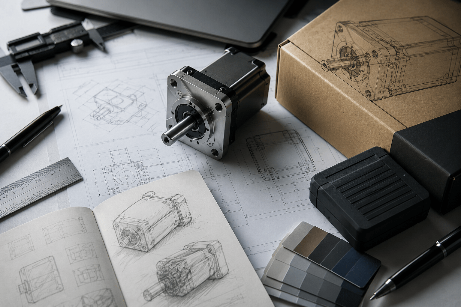
Product design is often described through shapes, materials, tolerances, prototypes, and manufacturing methods. That makes sense: a physical product has to be engineered before it can be sold, shipped, repaired, or scaled. But every product also depends on text. Labels, user manuals, CAD annotations, spec sheets, interface screens, packaging, assembly instructions, safety warnings, and marketing pages all need typography that works.
For designers, engineers, makers, and hardware startups, typography is becoming part of the product experience. A font choice can make a technical drawing easier to read, a product page more trustworthy, a control panel less confusing, or a brand system more consistent. Poor typography can make even a well-designed product feel unfinished.
The trend is not about making every industrial product look polished for the sake of style. It is about making information easier to understand throughout the product lifecycle: concept, CAD, prototype, production, packaging, support, and customer communication.
Why typography belongs in product design conversations
Product development is full of decisions that depend on clear written information. Engineers need labels that do not create ambiguity. Customers need manuals that can be followed without frustration. Buyers need product pages that make dimensions, compatibility, and use cases easy to compare.
- make dimensions, measurements, and part names easier to scan;
- keep warnings and compliance notes visible;
- support consistent packaging, manuals, websites, and app screens;
- make product dashboards and interfaces easier to use;
- help hardware brands feel more mature before they scale.
| Product touchpoint | Typography challenge | Better design response |
| CAD documentation | Labels, dimensions, tolerances, and notes must stay clear | Readable letterforms, strong numerals, consistent annotation styles |
| Assembly guide | Users follow steps under pressure or with tools in hand | Short sections, clear hierarchy, and visible warnings |
| Product page | Buyers compare specifications and compatibility | Readable tables, clear headings, and reliable numerals |
| Packaging | Brand voice and practical information compete for space | Distinct display type supported by plain body text |
| Device interface | Users need fast recognition of controls and states | Legible UI type, clear labels, and spacing |
| Support content | Troubleshooting must reduce frustration | Scannable headings, lists, and consistent terminology |
Engineering clarity and brand personality need different roles
A common mistake in hardware branding is expecting one expressive font to solve every problem. A display typeface can make packaging or campaign visuals memorable, but the same font may be unsuitable for technical labels, serial numbers, warnings, or long instructions.
Strong product typography usually separates roles. Brand type creates personality. Text type carries information. UI type supports interaction. Numeric styles protect measurements and specifications.
| Typography role | Best use | What to avoid |
| Display type | Logos, product names, hero visuals, packaging accents | Long manuals, small labels, and warning text |
| Text type | Documentation, support pages, guides, spec sheets | Making it so plain that the brand disappears |
| UI type | Buttons, screens, control panels, apps | Decorative shapes that slow recognition |
| Numeric style | Dimensions, prices, serials, voltages, tolerances | Ambiguous 1, I, 0, O, or 5 |
| Brand accent | Badges, callouts, feature highlights | Overuse that makes the system noisy |
Commercial and custom fonts both have a product role
Not every hardware brand, CAD tool, maker project, or industrial design studio needs a custom typeface. Many can build a professional system with a well-chosen commercial font family. Custom typography becomes more useful when a brand expands across products, apps, packaging, documentation, e-commerce, manuals, service portals, and international markets.
| Font option | Best for | Main risk |
| Free fonts | Early prototypes, student projects, internal concepts | Overuse or unclear commercial permissions |
| Open-source fonts | Developer tools, public documentation, maker communities | Still requires license review |
| Commercial fonts | Professional websites, manuals, packaging, dashboards, and campaigns | Requires budget and license tracking |
| Variable fonts | Responsive websites, digital product pages, and flexible design systems | Needs careful implementation |
| Custom fonts | Mature hardware brands, platforms, apps, and global product ecosystems | Higher cost and longer timeline |
Teams comparing professional font families, variable fonts, or custom typography options can review foundries such as TypeType when they need type systems that can be tested across websites, apps, dashboards, documentation, packaging, and brand materials.
Real custom font cases with lessons for product teams
Custom font projects from other industries still offer useful lessons for product design and engineering brands. The point is not to copy the style. It is to understand how typography supports consistency, usability, and recognition across many touchpoints.
Sartorius and customized TT Norms® Pro
Sartorius, a company connected with pharmaceutical and laboratory equipment, uses a customized TT Norms® Pro in its visual identity. This is especially relevant to product teams working in medical, scientific, industrial, or technical fields. The typography needs to feel precise, calm, and trustworthy rather than loud.
Dominos Sans for Domino’s Pizza
Domino’s Pizza customized TT Commons™ Pro into Dominos Sans Display and Dominos Sans Text. The product lesson is consistency. A customer can meet the same brand through packaging, menus, ads, mobile ordering, delivery updates, and in-store communication. Hardware brands face a similar challenge across product pages, user manuals, packaging, labels, software screens, and support documents.
Telefónica Sans for Telefónica
Telefónica Sans, based on TT Hoves, shows how a large communication brand can adapt an existing typeface to fit a wide identity system. For industrial companies and connected-product brands, this is practical: customization can make typography feel ownable while keeping a proven structure for complex communication.
SHIFTBRAIN Norms Variable
SHIFTBRAIN Norms Variable, based on TT Norms® Pro, shows how a customized variable font can become part of a digital-first identity. For product studios and hardware startups, the lesson is that typography can support responsive websites, launch pages, demos, dashboards, and interactive product storytelling.
Font licensing should be part of product operations
Font licensing is easy to overlook because fonts feel like creative assets. Legally, however, fonts are software. A license defines where and how a typeface may be used. A product company might use the same font on a website, CAD-adjacent documentation, mobile app, embedded interface, PDF manual, packaging, video, or product configurator.
| Use case | Licensing question |
| Website | Can the font be embedded as a webfont? |
| PDF manual or spec sheet | Can the font be embedded in downloadable files? |
| Mobile app or product UI | Does the license allow app or software embedding? |
| Packaging and labels | Are commercial print uses covered? |
| Logo or product mark | Is wordmark use permitted? |
| Video or product demo | Are motion and campaign uses allowed? |
| Contractors and agencies | Can font files be shared with collaborators? |
Common licensing mistakes
- using a personal-use font in a commercial product launch;
- using a desktop license as if it were a webfont license;
- embedding fonts in an app or device interface without software rights;
- sharing font files with contractors without permission;
- including fonts inside editable templates or source files;
- modifying letters without checking the EULA;
- losing license receipts before a redesign, acquisition, or audit.
Typography mistakes that weaken product communication
Most typography problems happen when teams approve a font from one attractive mockup. Real product communication is messier. A typeface must survive small labels, long part names, dense tables, mobile screens, diagrams, support articles, and international markets.
- using decorative fonts for warnings, dimensions, or instructions;
- choosing unclear numerals for measurements, voltages, prices, or part numbers;
- making documentation text too small;
- mixing too many typefaces across packaging, manuals, and websites;
- placing low-contrast text over product photography;
- forgetting multilingual characters and technical symbols;
- treating font licensing as a final legal check.
| Better choice | Why it helps |
| Readable body font | Supports manuals, guides, support pages, and product descriptions |
| Clear numerals | Reduces mistakes in dimensions, specs, and prices |
| Consistent labels | Makes product systems easier to navigate |
| Distinct display style | Adds brand character without hurting technical clarity |
| Documented license | Reduces legal and operational risk as the product scales |
What this means for designers, engineers, and makers
| Team or role | Typography can support |
| Industrial designers | Brand presence, packaging, presentation boards, and product storytelling |
| Mechanical engineers | Drawings, annotations, documentation, and technical clarity |
| CAD and 3D teams | Model notes, product visuals, tutorials, and interface labels |
| Hardware startups | Landing pages, pitch decks, manuals, and early brand trust |
| Marketing teams | Product pages, launch campaigns, spec comparisons, and ads |
| Operations and legal | Licensing records, contractor usage, and documentation rights |
The encouraging part is that better typography does not require a massive rebrand. A simple system with a readable text font, a clear heading style, strong numerals, and documented licensing can already make a product brand feel more professional.