If you were to wad up a piece of paper, throw it in my face and yell, “what’s your favorite artistically represented graphical element!” I’d have to wipe the blood from my lip, pinch my elbow skin and scream from the depth of my lungs, “A decent, yet imaginative typeface!” Nothin’ better in my mind, and it’s with much thanks to a fine young Italian designer named Riccardo Sabatini that I find myself gaping in face-wrinkled glee at his succulent san serif typeface of steam machine succulence, Mekkanika. Dine.
Mekkanika
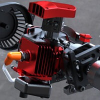
Mekkanika is a typeface inspired by old mechanics technical drawings, the steampunk visual world, and modern machinery, mixed and merged all together to form letters completely made by these elements, creating a mechanical look like typeface. And it’s the direct sequel to an old work of mine, THE MATRIX STEAM.
Here’s how he constructed the letters of the font you’ll see below. Each are started off the shape of the Din Alternate Black font. Some strategic placement of some mech style clipart aaaaaand you’ve got yourself one steamy set of letters. amirite?


Via Colossal. Thanks Rod!